Everybody loves infographics. They are a great way to visualize information and engage your audience in an interesting way. But what really makes an infographic successful? A lot more goes into it than just tossing together some numbers with pretty graphics. Bad infographics are sometimes worse than no infographics at all.
“In the last decade, we’ve seen the advent of such visual platforms as Instagram and Snapchat, and the dominance of YouTube. Our audiences are more visually literate than ever. They can recognize content that wasn’t crafted with care, and they don’t have time for it.”
– Excerpt from The Value of Infographics for Marketers in 2020 by killervisualstrategies.com
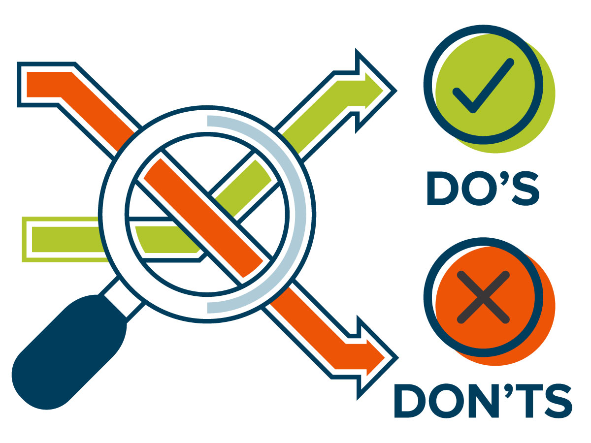
So how do you avoid the pitfalls of bad data visualization? Here are some do’s and don’ts to help you create more effective infographics:
Don’t show data without giving it context
Do tell a story
This might be the most important point on this list. All good infographics tell a story. What that story is depends on how the information is presented. Use a balanced combination of visuals and text to explain what the reader is looking at and help them to understand the story you are trying to tell.
Don’t try to tell too much at once
Do keep it simple
Too often, we see people cram too much information into one statistic or statement. You want to make sure that the information you are presenting is simple, quick, and easy to digest. If the message you want to send has multiple moving parts, try breaking it down into bite-sized pieces that fit together and can still help tell the story as a whole.
Don’t confuse the reader with odd design choices
Do show information in a way that makes sense
As designers, we are always thinking outside the box. But it’s important when it comes to infographics that we don’t stray too far. You want to make sure that there is a clear and logical focus to the infographic that people can easily follow.
Don’t misrepresent the information
Do use appropriate metaphors
It’s important to use appropriate graphics – abstract concepts and references can sometimes be confusing to readers. They do have their place, but you want to make sure that your point is not easily missed. It’s also important that you represent the information with appropriate ratios and use the appropriate charts. To avoid misleading your audience, use reader-bias to your advantage. Pie charts are assumed to show 100% of something, whereas bar charts have a broader range of use.
Don’t just use bar and pie charts
Do create graphics and data visualizations that are stimulating
To counter the last point, sometimes there are statistics or metrics that don’t fit neatly into a bar chart or a pie chart. This is when you can really get those creative juices flowing and start representing the data in a different way. Metaphors, icons, and typography are all tools that can help illustrate a point without the need for charts. Just be wary they aren’t too arbitrary – everything you do should still serve a purpose.
Don’t assume the reader is familiar with your topic
Do give some background information
It’s always good to take a step back from your information and think about the reader. If they weren’t familiar with your topic, would the message still be clear? It should be. And if it’s not, maybe think about rewriting the content or highlighting different statistics.
Don’t use a “one size fits all” approach
Do create unique graphics that fit the content
What works for one infographic might not work for another. It all depends on the metrics you are highlighting. You want to make sure that your story is clear and easy to understand. Trying to fit a square peg in a round hole won’t get you there. You’ll end up with an infographic that is confusing, and unclear.
Don’t clutter the space
Do leave plenty of breathing room
It’s important to give the information and graphics appropriate white space. If you’re feeling there isn’t enough room, try cutting down the information, or breaking the infographic into separate pieces that each tell their own part of the story. Overcrowding the space can be overwhelming and confusing.
Don’t forget to think about how this is being used
Do craft your content for each application
Last but certainly not least, don’t forget to think about how this infographic will be viewed. Is this part of an article? Or will this be posted on Instagram? Two totally different audiences, each requiring very different approaches. Articles and other more content-heavy pieces allow for more of your graphics to be seen within the larger context. Social media on the other hand should be reserved for shorter, quick-to-digest story points that don’t need as much explanation.
Key questions to ask yourself when creating an infographic:
- What is the story we are trying to tell?
- How can this information be visualized? What information stands out?
- What are the main takeaways from this infographic? What should they be?
Still struggling? At Cleveland Design, we can lift that burden and help you to create a successful infographic with a clear message. Contact us today.
Related articles:
How to Write a Compelling Infographic Story in 5 Steps
by Column Five Media
Infographics, Motion Graphics, & Beyond: How to Tell Data-Powered Stories
by Killer Visual Strategies